

Bentley Docs was built primarily around browsing by product, but the experience made it difficult for users to move efficiently from a known product to the information they needed. The landing page functioned largely as a product catalogue, with an inefficient product finder and limited context around each product.
Once users reached a product, they were often presented with multiple similar documentation links that were difficult to differentiate, creating uncertainty about where to begin. The experience also offered limited support for users who did not already know which Bentley product was relevant to their task. As a result, users were required to understand the structure of Bentley Docs before they could efficiently find the information needed to complete their task.
Our discovery work showed that most Bentley users already knew which product they needed. The bigger opportunity was helping them move from that product to the right information faster. Research also showed that users typically arrived with a task or problem already in mind, whether they were learning a workflow, troubleshooting an issue, or looking for a specific piece of product information.
This shifted the focus of the redesign from simply helping users browse documentation to helping them move more directly from a task or problem to the right information.
The redesigned Docs home experience prioritized different paths based on what users already knew and how they wanted to begin.
The AI assistant became the primary call to action on Docs, giving users a more direct way to begin with their task rather than the structure of the documentation.
Users could describe what they were trying to accomplish in natural language and use the assistant to surface relevant information without first knowing where it lived.
This entry point was also carried through to individual product pages, allowing users to access the same AI assisted path no matter where they were in their journey. Whether starting from the Docs home or already browsing a specific product, users could move from a question toward relevant documentation without restarting their search.
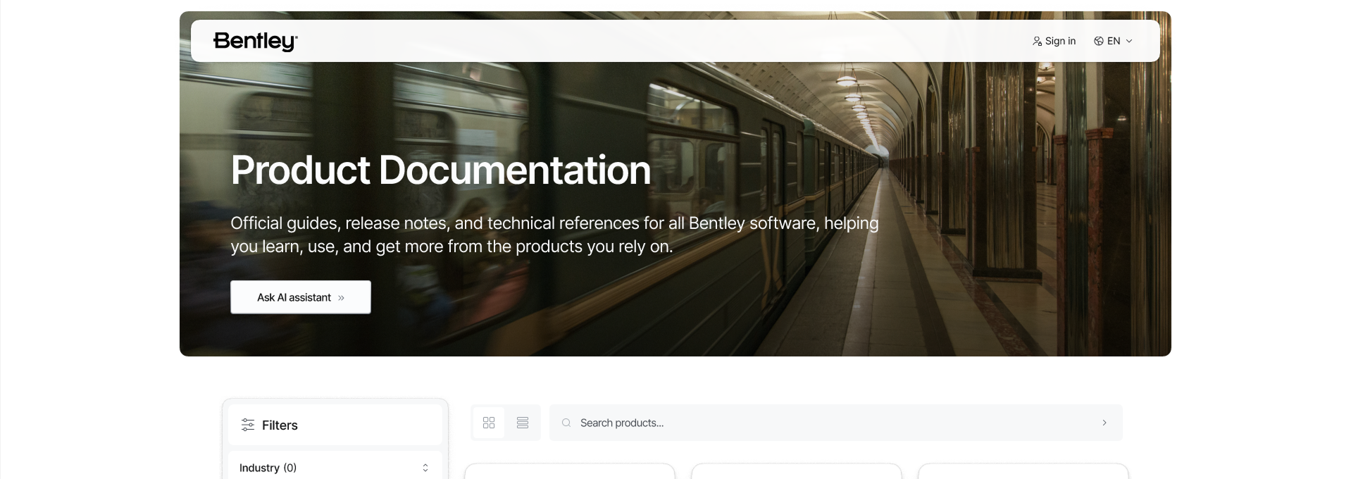
For users who already knew their product, the product finder was redesigned to make navigation more efficient. Clearer filtering and categorization helped narrow Bentley's large product catalogue, while descriptive product cards provided more context before users entered the documentation. These descriptions also supported users who were less familiar with Bentley's portfolio by helping them understand what each product was for and identify the most relevant destination.
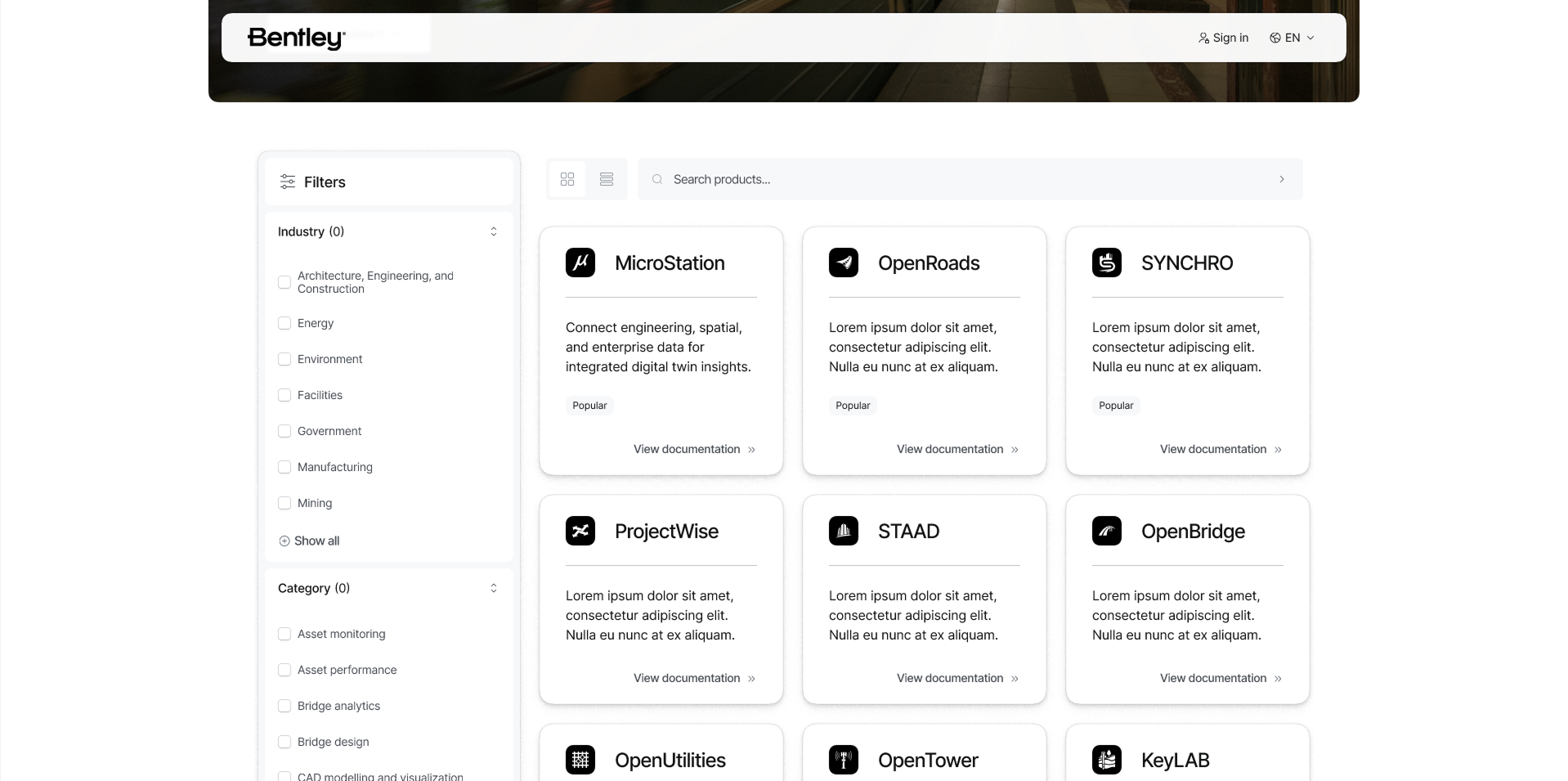
The redesigned Docs home also provided clearer wayfinding to resources beyond product documentation, including Bentley Communities, the Knowledge Base, Bentley Learn, webinars, and other support content. Together, these paths shifted the landing page from a product catalogue into a starting point for finding answers.
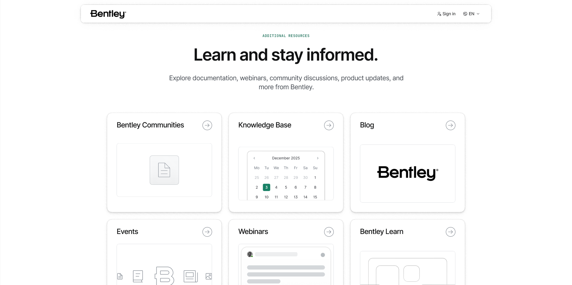
The redesign also explored how signing into Docs could reduce repetitive navigation for returning users. A personalized home experience could surface products and resources based on the user's Bentley ecosystem, including licensed products, recently viewed documentation, saved resources, and frequently accessed content. Rather than presenting every user with the same starting point, the goal was to use existing context to shorten the path back to the information most relevant to them. For returning users, Docs could become less of a catalogue and more of a workspace.
The redesign extended beyond the Docs homepage into the structure of individual product experiences. Previously, product documentation was scattered across multiple similar links, with limited context about where to begin or how one resource differed from another.
The new concept introduced a dedicated Overview page for each product, creating a centralized starting point before users entered the full documentation structure. The Overview brought together important information such as product updates, developer notes, popular resources, frequently accessed articles, and documentation entry points. This gave users more context about a product while also creating clearer paths toward common tasks.
Rather than dropping users directly into the documentation hierarchy, the Overview gave each product a recognizable starting point. Users could quickly understand what was new, discover commonly used resources, and decide where to go next.
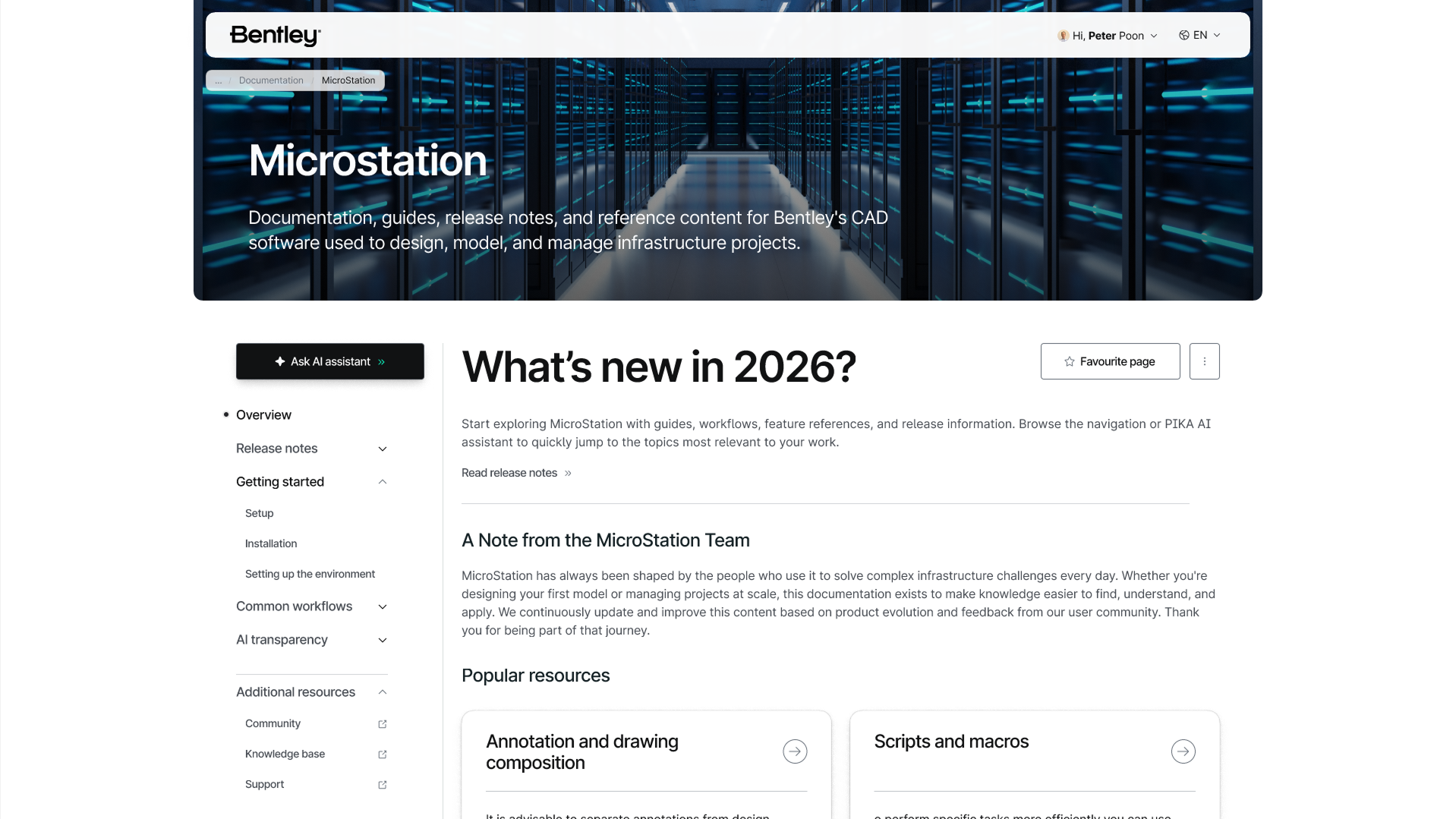
A standardized table of contents was introduced across product pages to create a more predictable documentation experience. Rather than each product presenting its information differently, users could build familiarity with a consistent structure and know where to look regardless of which Bentley product they were browsing. Common areas such as release notes, getting started content, workflows, supporting resources, and other documentation could follow a recognizable hierarchy across the platform.
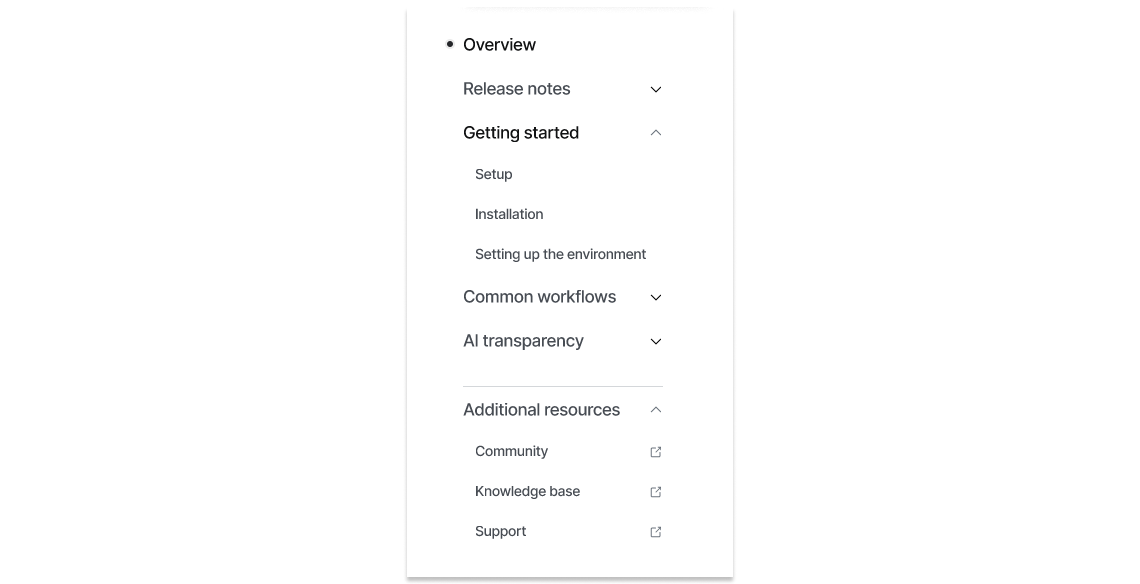
The AI assistant remained visible within the product experience as a persistent alternative to navigation. Users who could not locate information through the table of contents could ask a question directly without leaving the product page or returning to the Docs home. Together, the Overview, standardized navigation, and persistent AI access turned product pages into clearer destinations rather than gateways to another collection of links.
We tested the concept with five participants representing different relationships with Bentley products, including end users, administrators, and decision makers. The sessions explored first impressions, findability, navigation, personalization, and how users understood the redesigned Docs experience.
Testing helped us identify which parts of the concept aligned with existing behaviours, where the new experience reduced friction, and where further refinement was still needed. Most importantly, the research reinforced the value of designing Docs around user intent. Users could still navigate through products and documentation when that matched their existing behaviour, while AI, personalization, and clearer information architecture provided more direct paths when it did not.
The project established a future direction for Bentley Docs, evolving the experience from a documentation catalogue into a more intelligent way to find answers. By combining task based discovery, AI assistance, personalization, clearer product discovery, and standardized product experiences, the concept explored how Docs could reduce navigation effort without sacrificing the depth of Bentley's technical documentation. The work ultimately reframed the role of Docs. Instead of simply helping users navigate documentation, the experience could help users get closer to solving the problem that brought them there.
If you like what you see and want to work together, shoot a message to the email below.
ptr.khp@gmail.com