
At Staples Canada, we understand that design is not linear. We follow an iterative design process that aims to incorporate the cycles of problem identification, solutioning, and growth measurement.
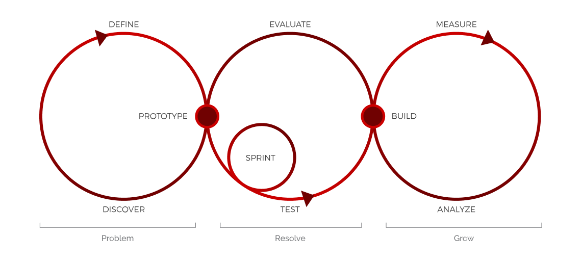
Using this design process, I created a design roadmap to help Product Managers and Stakeholders remain aligned in timeline while avoiding scope creep. The roadmap was split into three phases:
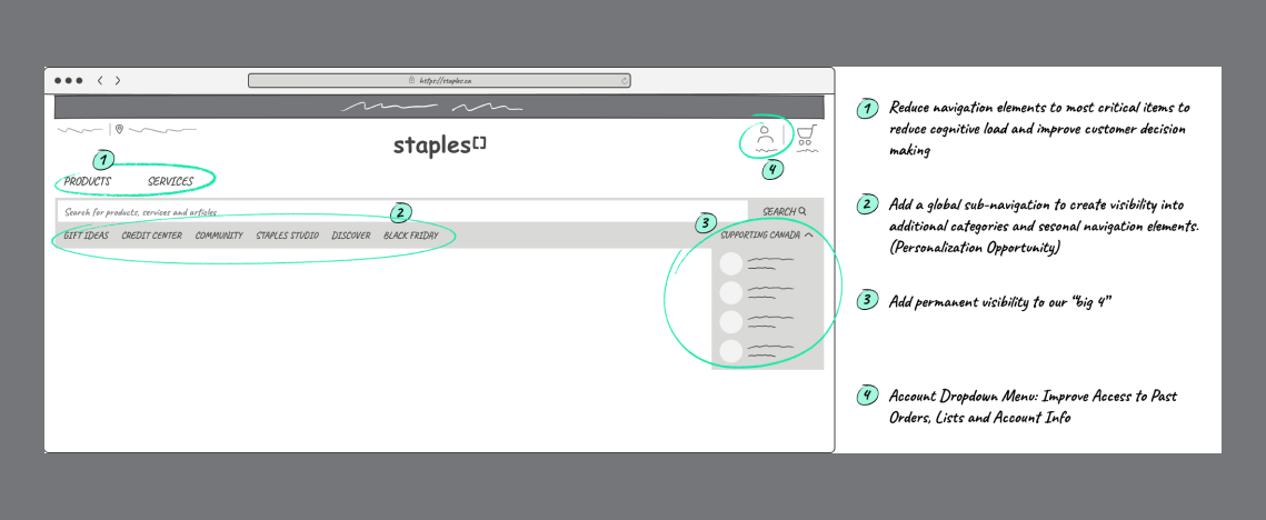
Through research and user insights, we discovered the following problems with the old site header.

Visualized above are saccade pathways of two customers that we conducted our scannability test on. We learn from their eye movement that they have completely dismissed important areas of the header such as the Store Locator and My Account. We further confirmed this to be the common case after internal testing and investigating with multiple focus groups.
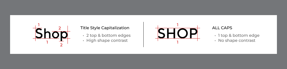
The use of all caps can significantly reduce readability of texts especially for those with reading disabilities because it has no difference in shape and form one big rectangle. When we read, we don't actively read every letter in a word. Instead, our brain recognizes word shapes to help scan texts. All caps should be avoided in navigations that contain a plethora of links and items.

Despite having a max width search bar, it becomes hidden when a navigation tab is expanded. As a result of this, customers are feeling frustrated when they have seemingly lost the ability to search. On top of that, the only way to collapse the menu is by clicking on the original tab itself.
We can also observe that the menu items and marketing banner have been swapped in position. Because users are mainly accustomed to reading from left to right, customers are not made aware of additional links because they are not presented first.

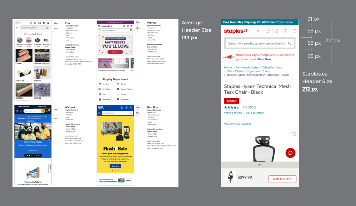
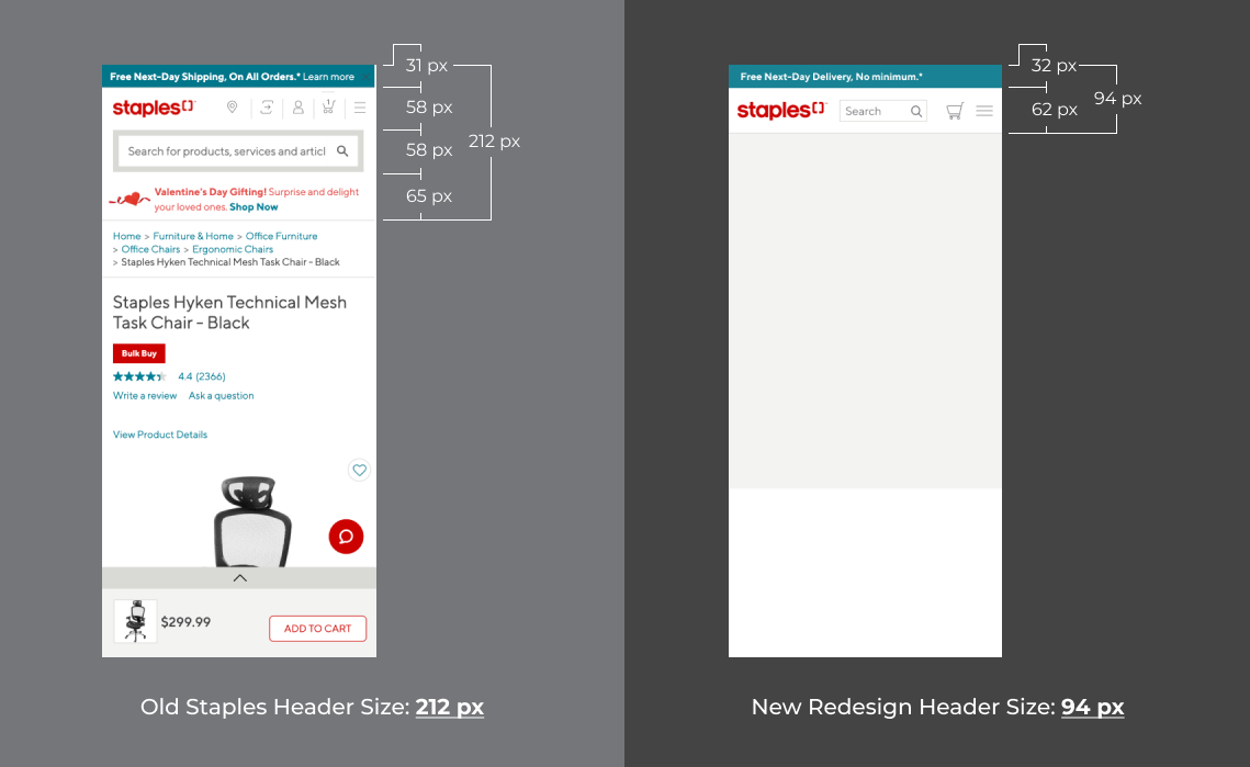
Our research on retailers found out that the average mobile header is around 137 pixels tall. Staples' mobile header stand at a whopping 212 pixels tall. Combined with the breadcrumbs component, the header takes up roughly 35% of a typical user's phone.
Based on the above problems identified, I addressed these pain points by designing with these solution intents:
I started by hosting several rounds of exploration and planning with a UX Researcher. It was necessary to prioritize issues and frame what was foundational to the header redesign.

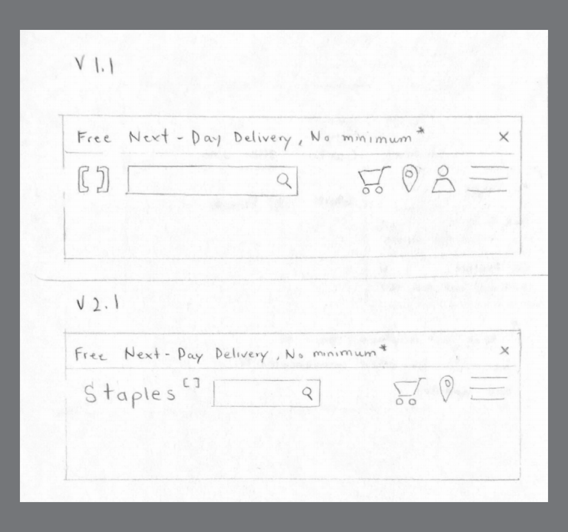
Following early exploration, I gathered additional feedback from Product Managers and mocked up Low Fidelity Wireframes on paper based on their recommendations. After some iterations, I moved onto High Fidelity designs.

An inclusive header design that scales with the company, is scannable with ease and delightful for Staples customers to use.
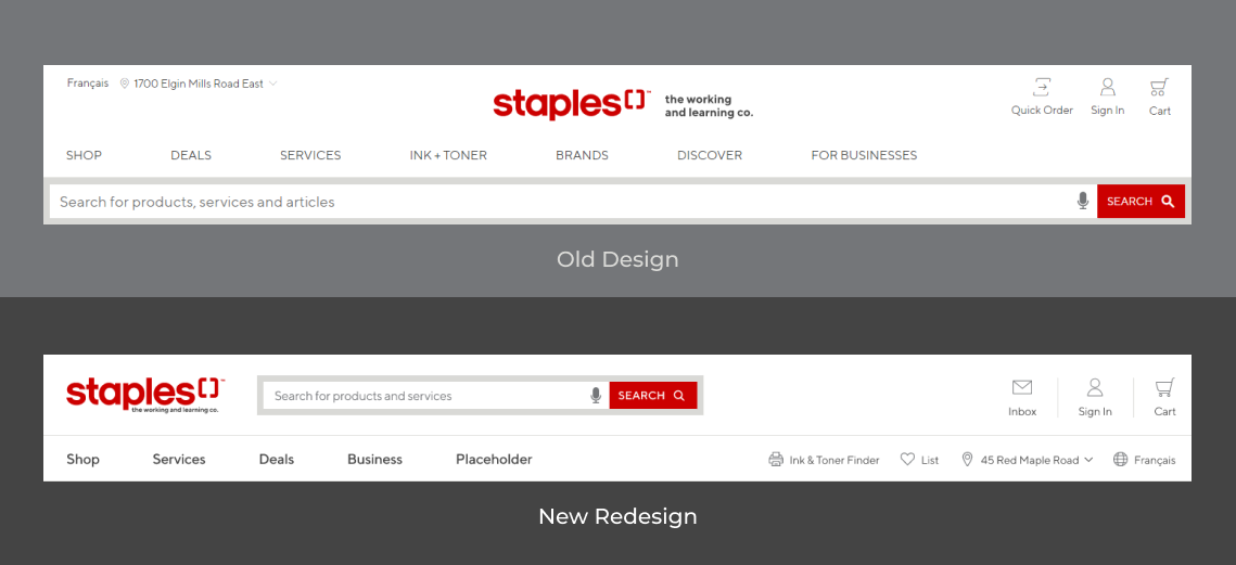
I designed the new header by incorporating a Z-Pattern layout that users are most likely to follow. Using this layout helps to create a visual hierarchy that places essential elements in a way that they will get noticed.

During testing, users successfully identified elements located in the Z-Pattern more than any other elements. In the old header, important elements of the header are easily dismissed by scanning the Z-Pattern layout. However in the redesign, elements are grouped by relevance to the user's needs on their first arrival. The design entices visitors to look first at the brand, then ability to search, sign in, and finally shop.
As I reframed the header, I designated a place for the search bar to live so that customers are able to search anytime and anywhere in their product discovery phase or purchase journey.
By giving search and navigation their own spaces, users are now able to quickly go back and forth between the two functions. This separation between the two also creates a design structure that helps to improve recognition of navigation elements.
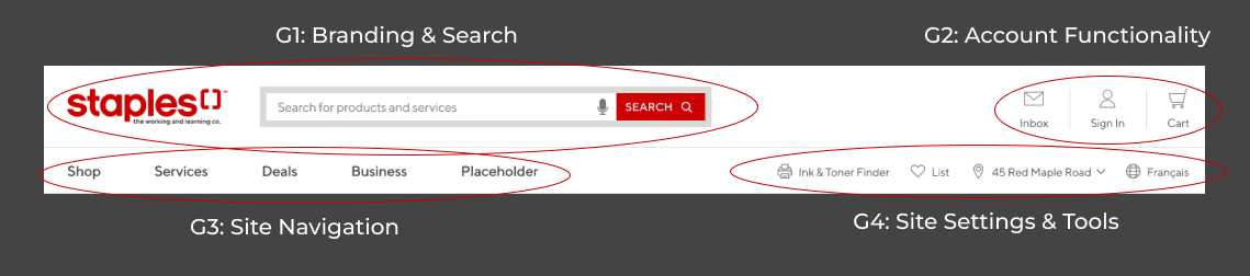
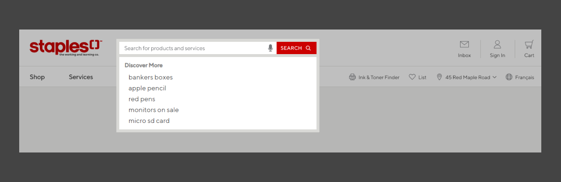
Elements are now bunched together into identifiable groupings thus reducing cognitive load and improving customer decision making. Customers learn to understand that the top left portion is reserved for the brand and search, the top right is for account functionality, the navigation and site settings follow after.
Long scrolling pages on mobile can be frustrating and annoying to browse. The new header has been reduced significantly in size to eliminate redundant scrolling and hero sections from being pushed below the fold.
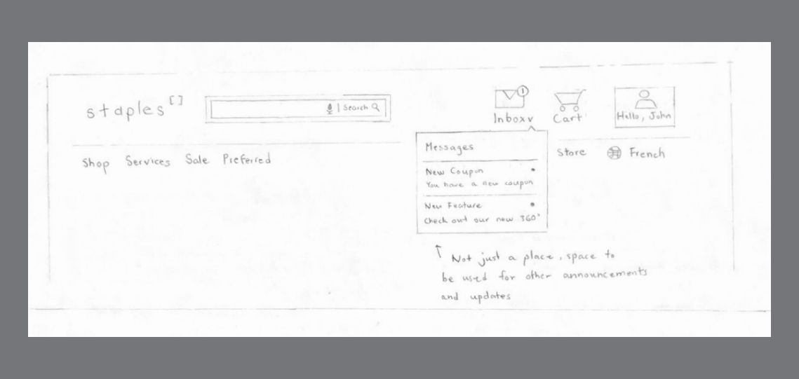
In an age where shopping experience is so dynamic, implementing personalization can create a bond between the customer and the brand.
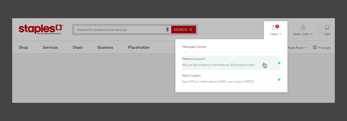
In the redesign, we introduced a message center with the goal of humanizing Staples. We wanted to let customers know that we understand their buying habits and needs. The message center opens up an opportunity to connect with the customer using tailored messaging and promotions.
We started by rolling out small changes to test and analyze with our customers. Additional testing is being conducted to determine which pieces of the redesign are impacting customer engagement and conversion. We need to answer the question: does the analytics meet the proposed expectations of the redesign? What are some future opportunities?
Altogether the redesign has set a new foundation for Staples Canada and I am excited to see how customer behaviour will affect the future of Staples.ca.
Thanks for reading!
If you like what you see and want to work together, shoot a message to the email below.
ptr.khp@gmail.com